What's in this topic
This topic describes the JavaScript used in Magento out-of-the-box Blank and Luma themes to relocate certain elements and change their behavior depending on the breakpoint.
Scripts general overview
The Blank and Luma themes use the following scripts to responsively relocate page elements by breakpoint:
responsive.jsmenu.jsmatchMedia.js, used byresponsive.jsandmenu.js
The script files are located in the file system as follows:
в”ңв”Җв”Җ app/design/frontend/Magento/blank/web/js/
в”ңв”Җв”Җ responsive.js
в”ңв”Җв”Җ lib/web/
в”ңв”Җв”Җ matchMedia.js
в”ңв”Җв”Җ mage/
в”ңв”Җв”Җ menu.js
See one of the following sections for more information:
responsive.js
The responsive.js script implements specific responsive functions for the Blank and Luma themes. To manipulate JavaScript for the desktop or mobile view, responsive.js calls the mediaCheck() anonymous function from matchMedia.js.
The mediaCheck call looks as follows:
/*...*/
    mediaCheck({
        media: '(min-width: 768px)',
        // Switch to Desktop Version
        entry: function () {
            /* The function that toggles page elements from desktop to mobile mode is called here */
        },
        // Switch to Mobile Version
        exit: function () {
            /* The function that toggles page elements from mobile to desktop mode is called here*/
        }
    }); /*...*/
For example, responsive.js changes the view of the checkout progress block on the checkout page:
- For the desktop view, the checkout progress block is permanently displayed on the left-hand side.
- For the mobile view, it is moved by CSS to be displayed under the checkout steps.
responsive.jsmakes it a toggled block: by default, the checkout progress information is hidden in the Your Checkout Progress section and it is visible after you click it.
menu.js
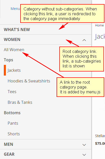
In a mobile view, on the 768px breakpoint, menu.js changes the navigation menu look and behavior the following way:
- Category menu items are not displayed, but are accessible after clicking the menu icon.
- The behavior of a category link depends on whether the category has sub-categories:
- If sub-categories exist, the category link behaves as collapsible block. Clicking a category link does not redirect to the category page immediately. Instead it opens a list of sub-categories, including the All category products option.
- If there are no sub-categories, the category link behaves as usual.
The following image illustrates the mobile-view navigation menu.
Re-using Magento scripts in your theme
You can use the menu.js, responsive.js and matchMedia.js to add responsive behavior in your custom theme.
If your theme inherits from Blank or Luma, you do not even need to additionally include the script files in your theme.
If your theme does not inherit from Blank or Luma, to be able to use the scripts, you must configure RequireJS for your theme.
Find us on