Responsive web design (RWD, also referred as responsive design) crafts web sites to provide an optimal viewing experience across a wide range of devices (from large, high-resolution desktop computer monitors to mobile phones).
The out-of-the-box Magento Blank and Luma themes (Luma inherits from Blank) use the mobile first RWD approach. It is ensured mostly by means of CSS and JavaScript.
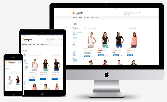
The following image illustrates how the same page built on the Blank theme looks on mobile, tablet and desktop devices.
We recommend using the Blank theme, as a starting point for your customizations. That is, your custom theme should inherit from Blank.
The articles in this chapter describe the particular approaches used in the Blank theme, and provide practical recommendations on how to use these approaches in your themes:
- CSS in Magento responsive design
- JavaScript in Magento responsive design
- Customizing RWD: illustration
- Create a responsive mobile theme based on Blank
Terms used
| Term | Description |
|---|---|
| Breakpoint | The width of the user鈥檚 screen that causes your responsive layout to change. |
Find us on